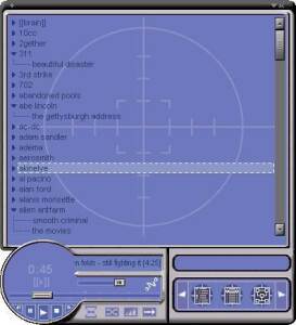
I watched the “the Social Network” movie and like many of the people, I wanted to know more about the music tasting app ‘Mark’ talks to Winklevoss’ in the movie. After a few minutes of searching here and there I found it. The application is called Synapse Media player and it is basically an app that uses artificial intelligence to learn the user’s listening habits and then recommends music based on the tastes of the listener. It works pretty much like last.fm does.
Mark Zuckerberg created the app in early 2000’s. Microsoft as well as AOL tried to buy the app from Mark and recruit him. However, Mark declined their offer and uploaded the app for free. The Application was very popular and was featured on the SlashDot. It was given a rating of 3/5 by PC Mag. Mark didn’t join AOL or Microsoft either, instead he went to the Harvard to continue studies and later found FaceBook.com
You might want to download the Synapse Media Player, but Last.Fm is much better than that – atleast now. Here are some reviews of the app that were written back in the day.
This is by far the most innovative media player I have see to date the only function I find it lacking is a more advanced tag editor and the ability to group by Album.
This review was written in 2003. Another interesting review below.
I’ve been using Synapse media player at home and work for the past month or so, since seeing it mentioned on slashdot.org. It’s a bit buggy, for example audio often glitches at the beginning of a song, and I get an error when I go to view the Log from the web interface. The English query interface can do unexpected thing from time to time as well, however, all complaints aside, the Brain feature of Synapse is quite amazing. It takes it a while to learn, and it’s noticable that it’s constantly in a state of learning/re-learning, but after using is a while it becomes quite impressive. At first it starts playing Mozart right after Led Zeppelin, but keep training it and you’ll like it!
Below is the screen-shot of the app, too much blue like the good old FaceBook design.
The design is not the best in the world, but considering it was back in early 2000′ – we can’t really expect anything better.
